Comprehensive design solution for an AI-based voice data processing and analytics startup
Vertical: Analytics, Processing, AI
Link: calldna.ai
Client
Our client is a startup specializing in processing and analyzing voice recordings using artificial intelligence. Its main advantage is the automation of voice processing to increase the efficiency of various businesses. CallDNA automates the processing of each transcription to identify key moments, so the client doesn’t waste time manually reviewing and listening to calls.
Challenge
Collaborating with CallDNA startup became a valuable experience for our team due to the technological complexity of their product, its unique subject matter, and niche. It’s not often that we get the opportunity to work on a project related to the automation of call centers and support services.
We faced the task of developing a comprehensive design solution, as the Client only had a name, business positioning, and the digital product itself in a rather “raw” UI form. We needed not only to create a logo, choose colors, and design a website but also to develop this website and launch it on hosting.
Solution
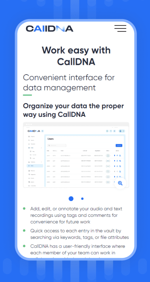
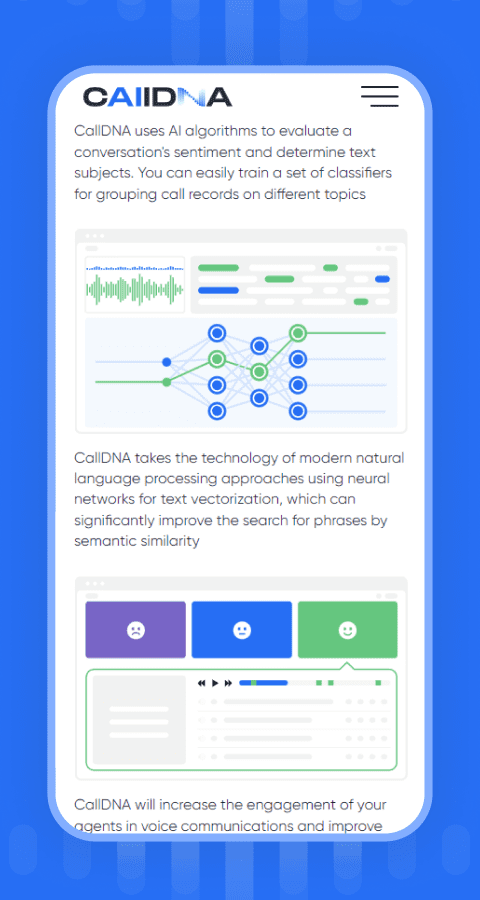
Our expertise allowed us to find a solution for this complex task. Using the tools and advantages of minimalism and “clean” design, we were able to create a logo, branding, and website. The website focuses the user’s attention on the simplicity of using complex technological solutions offered by CallDNA. Our approach involved using simple informative visualizations that clearly demonstrate key indicators and results of voice recording analysis.
Revealing brand identity through synthesis of images in the logo
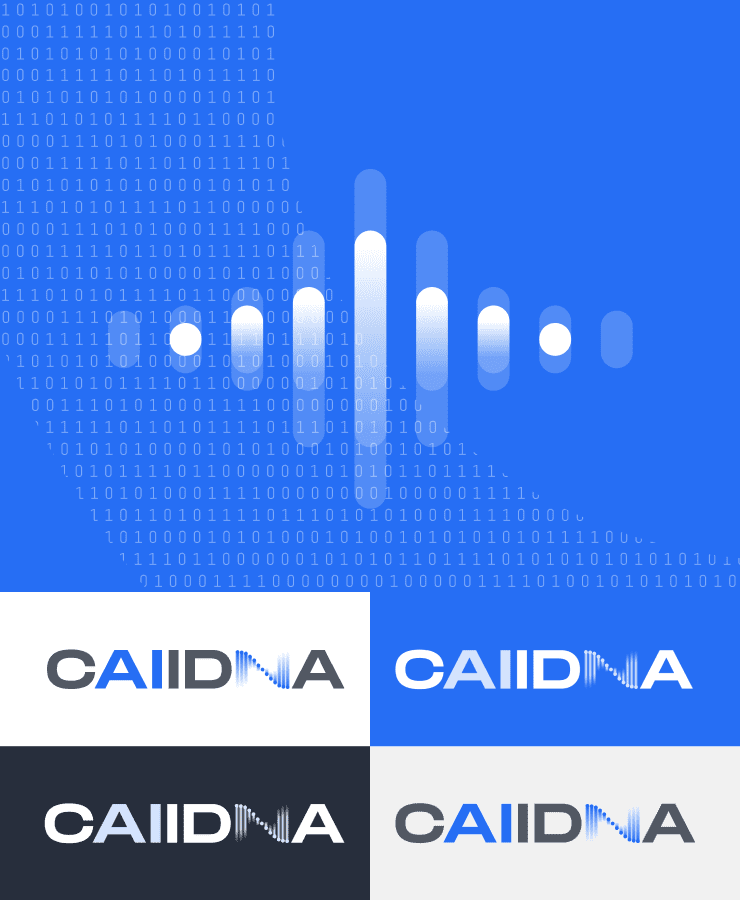
Our task was to create a logo with a visual emphasis on the company’s use of artificial intelligence. The combination of an audio wave with the DNA structure allowed users to correlate the visual perception of the brand name with its activities. The logo shows the startup’s direction and the uniqueness of its proposed solutions.
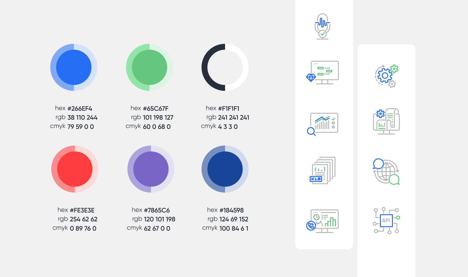
Palette of trust – colors of visual image
White and bright blue were chosen as the main colors – colors of calm and trust. Green was used for Call to Action – a color of growth and balance. An additional purple color added variety and necessary accents to graphics and visuals. This palette creates a harmonious and balanced perception of the brand, reflecting its reliability, progressiveness, and innovation.
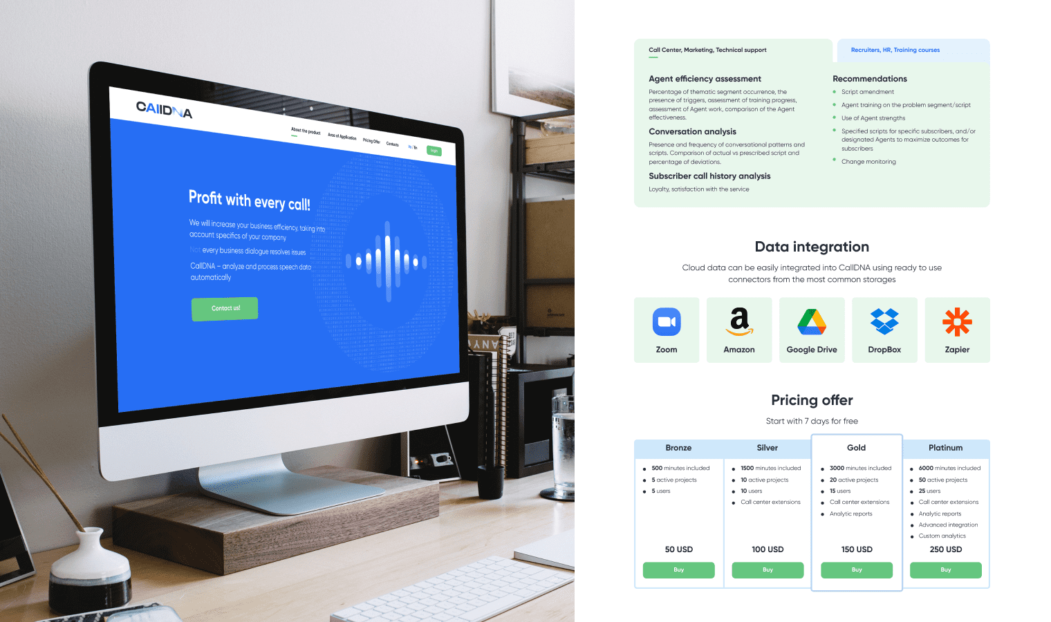
Website demonstrating the startup’s innovative values
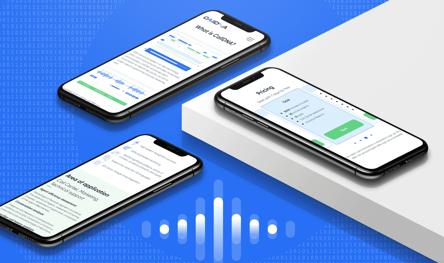
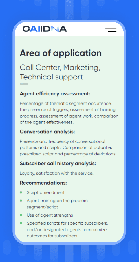
The complexity and high technology of the company required simplicity and clarity in the website design and structure. That’s why the site is a single-page landing, which contains all the necessary information: from product description to prices. We made its style simple and modern to attract the attention of users and potential partners.
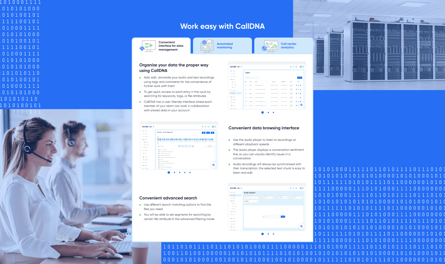
To implement the site, a separate WordPress theme was developed with data submission through a contact form. We paid special attention to implementing adaptability for different types of devices. Our HTML coders accurately reproduced design layouts in markup and added the ability to zoom in on complex diagrams and visuals.
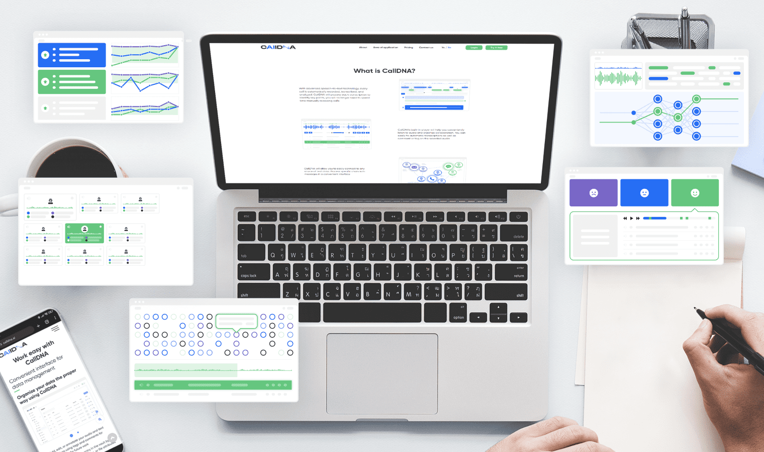
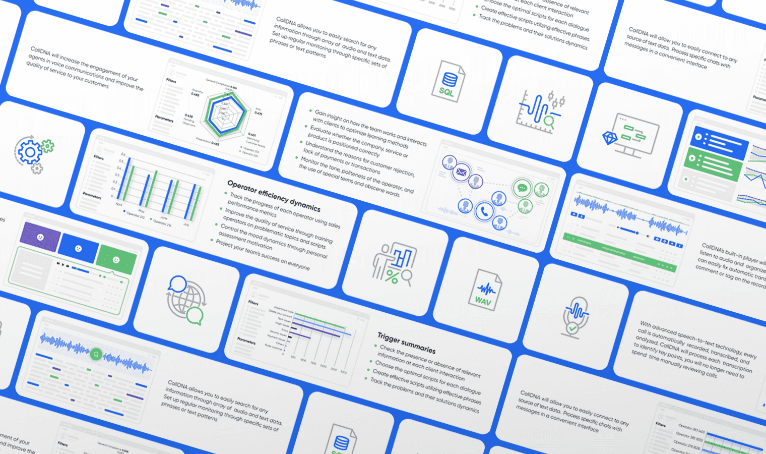
During the website design development process, there was a need to illustrate complex technological functions and product advantages. This was quite an interesting and non-trivial task. Our designer created concise and easy-to-perceive drawings that perfectly individualized the visual part of the site.
Presentation as an extension of the brand: a comprehensive design approach
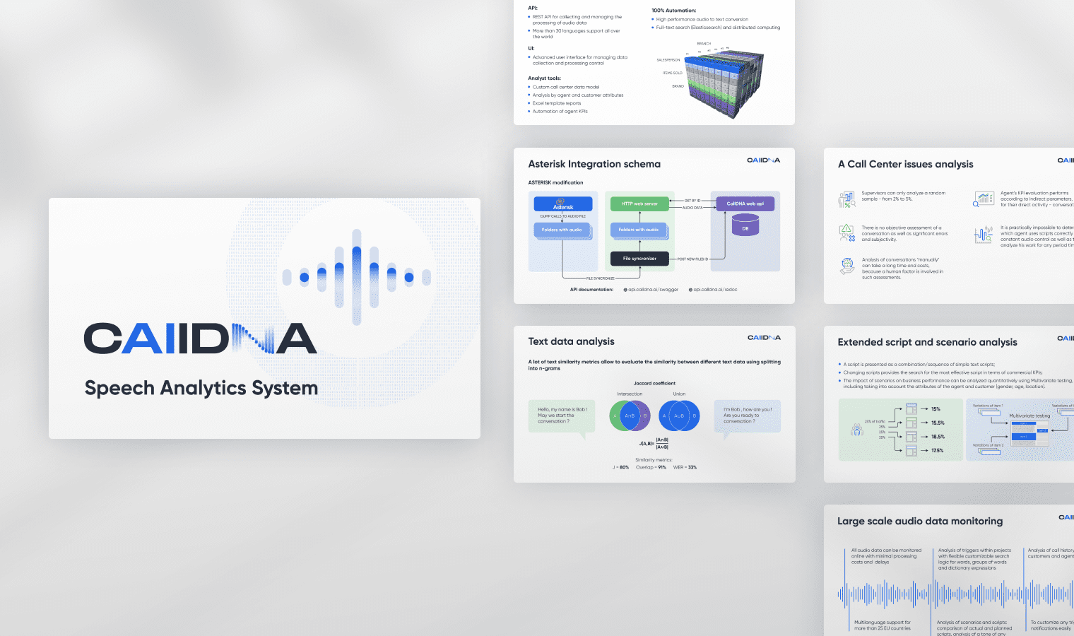
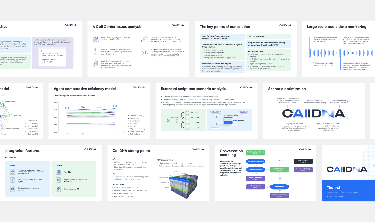
Presentations are a very important tool for a startup to conquer the market and attract new clients and investors. We made it effective through unity with the website style, clear presentation of information, meaningful illustrations for content, and understandable infographics and diagrams.
Result
RESULTS after 3 months of collaboration:
- Logo and brand identity
- Website
- 20+ illustrations
- 2 presentations
Project Team:
- Art Director
- 2 Designers
- 2 HTML Coders
- 1 Managers

