Creating branding and a website for the gaming startup Playcent Games
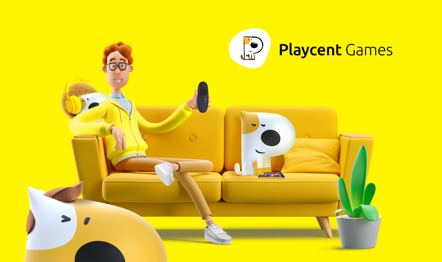
Playcent Games is a startup in the CTV games industry. It has brought together the best developers, game designers, and storytellers to create high-quality products at a new level. This young and ambitious company aims to revolutionize the CTV industry.
Vertical: CTV / OTT, Games
Challenge
Our task was to introduce a new player to the market in a bright and memorable way. The project implementation needed to consider: ambitions, goals, vector of activity, niche, and targeting. The brand and online presence, including the website and social media accounts, had to be interesting for both users and future partners.
Solution
Creating a Mascot for the Logo
Given the company’s field of activity, we wanted to create a unique and recognizable logo that also met the standards and spirit of the gaming industry. It all started with sketches on paper. One of the variants, where the letter “P” was styled as a dog, appealed to both us and the client. We refined it, and the brand got its face in the form of a friendly mascot.
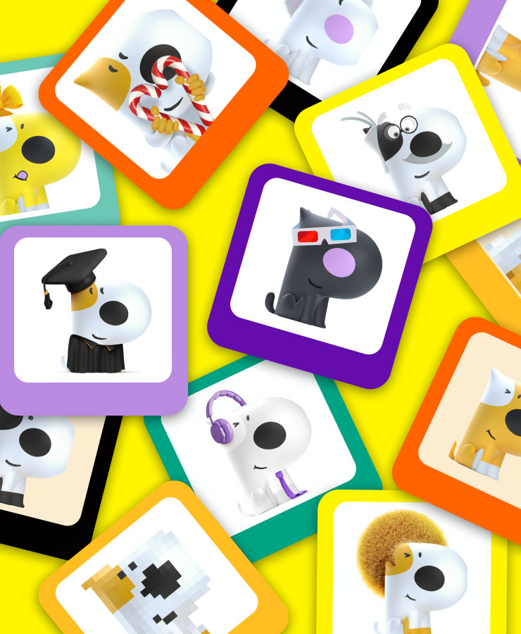
We then recreated the mascot in 3D, giving it many different looks. Each look helped us create the appropriate mood and theme in the illustrations.
Color Scheme Reflecting the Company’s Spirit
We needed to choose a color palette that matched the brand’s energy and ambitions. We settled on yellow and its shades. Yellow is not only the brightest color on the color wheel but also the color of energy, happiness, and optimism. It fits perfectly with the mood and theme of games and draws attention to key design elements. For balance, we added black and white.
As a complement to the main colors for presentations and promotional materials, we added shades of periwinkle and emerald to the palette.
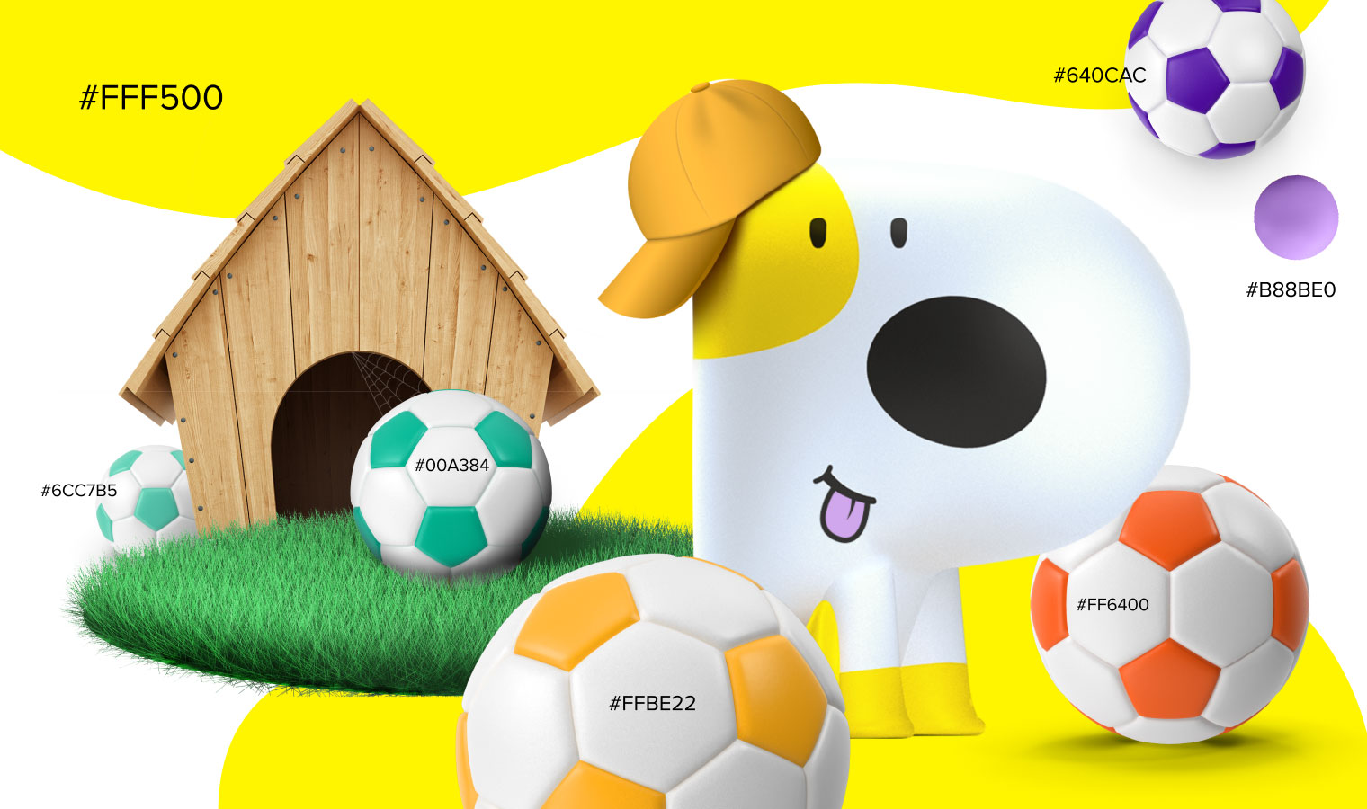
Playcent Website: Balancing Space and Content
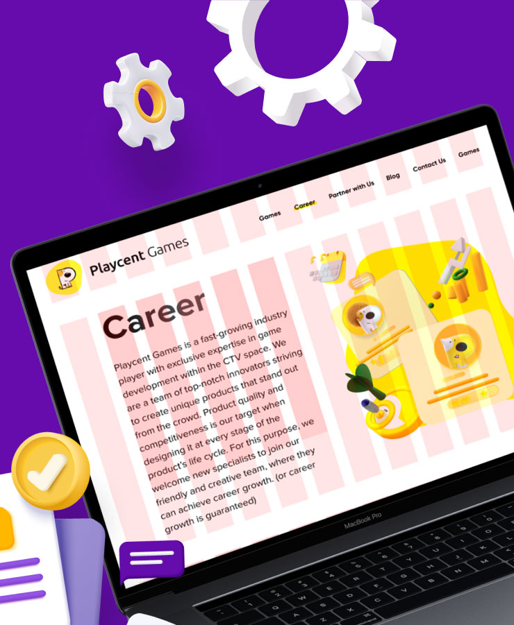
The modern and minimalist website design emphasizes the simplicity and convenience of working with Playcent. We created graphic elements in the form of 3D elements on a solid background. The lightness of the design is emphasized by white space around bright content blocks. The responsive website design easily transforms for any screen size of the user’s device.
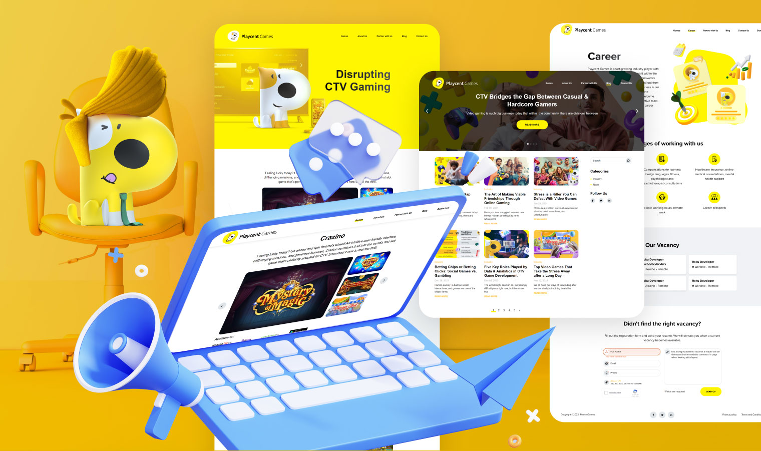
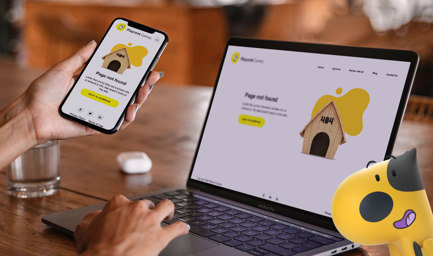
Considering that the site needed a blog, we chose WordPress for its technical implementation. This CMS has proven itself in the market and gives clients a convenient tool for independently filling and changing content on their resource. Our HTML coders did a quality job, as evidenced by the Google PageSpeed test results.
Desktop
Perfomance
Accessibility
SEO
Perfomance
How Brand Styling Comes to Life on Social Media
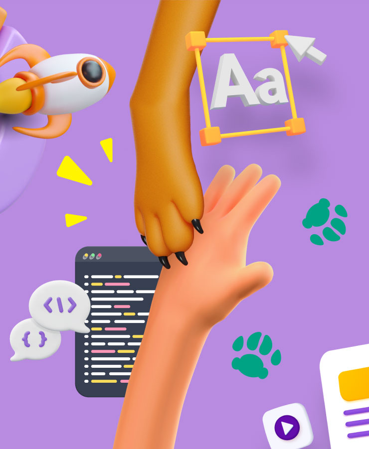
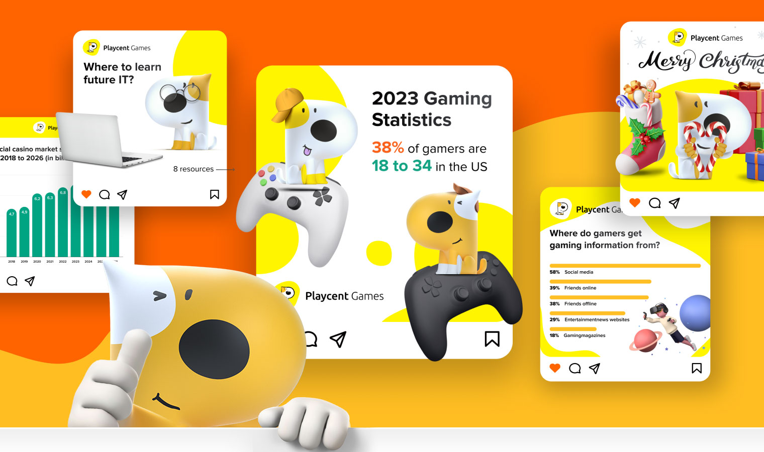
Promotional materials for social networks are an interesting and important part of working with the brand. Thanks to the mascot and chosen styling, we had an inexhaustible number of concepts and ideas for creating bright visuals.
Attention-Grabbing Presentation Design
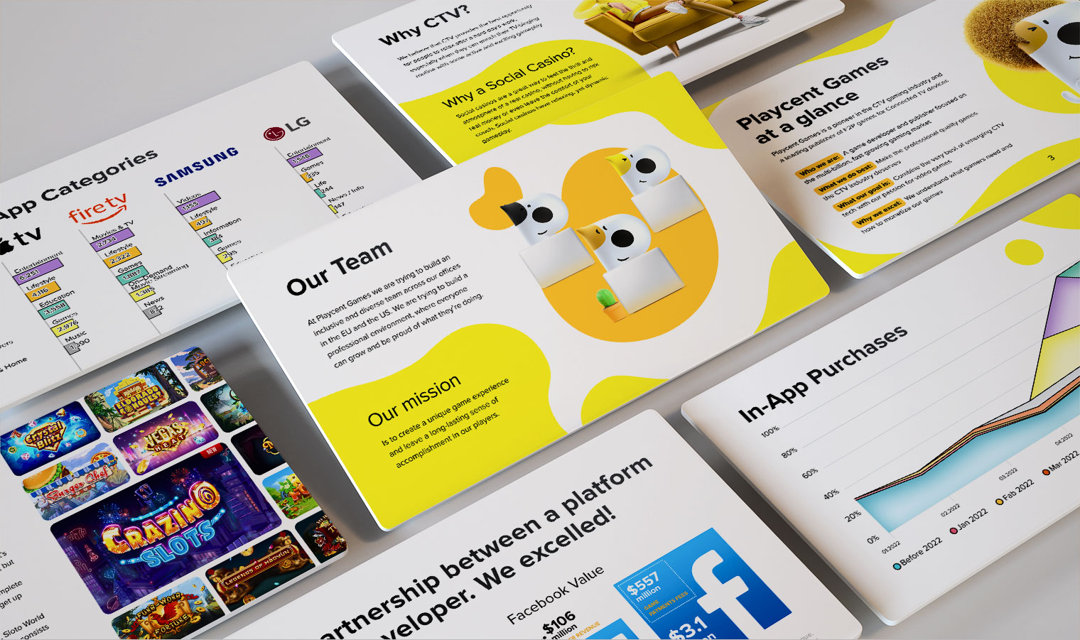
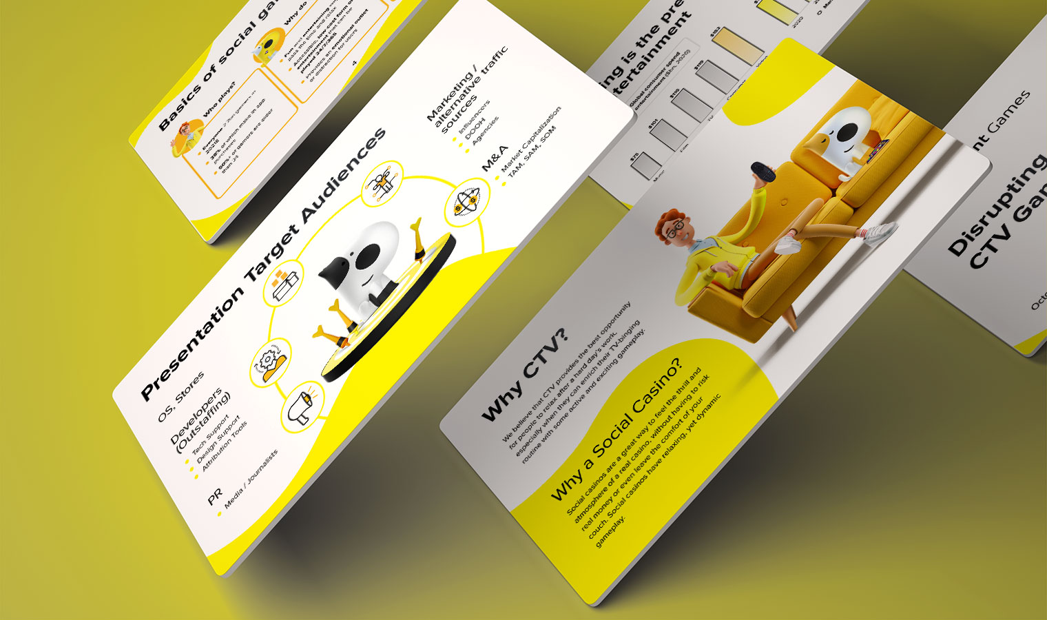
Like the website, we made the presentations in a minimalist style on a white background with bright blocks. For contrast and to attract attention, we used shades of yellow as background colors. We supplemented the texts with 3D style images. We also developed a look for diagrams that would match the logo style.
Results
Over a year of collaboration with the client, we created:
- 5+ Website pages
- 2 Landing pages
- 5+ Emails
- 10+ Presentations
- 150+ Banners
Project Team
- Art Director
- 5 Designers
- 3 HTML Coders
- 3 Managers
