Branding and website design for a summit dedicated to the future of the space industry
Noosphere Space Summit is an event dedicated to New Space and general trends in the space industry. The conference invited industry experts from around the world who prepared reports on the latest trends in space and engineering sciences. The goal was to stimulate the discovery, use, and dissemination of scientific knowledge, as well as to revitalize community and business interest in science.
Vertical: Space, Events
Link: noospheresummit.space
Challenge
The organizers approached us with the task of creating branding and a website for a new space event. Given the industry specifics, the requirements included: conciseness, versatility for future use, and alignment with the New Space vertical. Our team needed to develop a unified, universal design that would be used in all types of visual communication.
Solution
For successful project implementation, we thoroughly examined both the space industry itself and analyzed other conferences of similar themes to fully understand the Client’s needs. Attention to detail, planning, and consistent execution allowed us to complete the task on time with a fairly large number of involved performers.
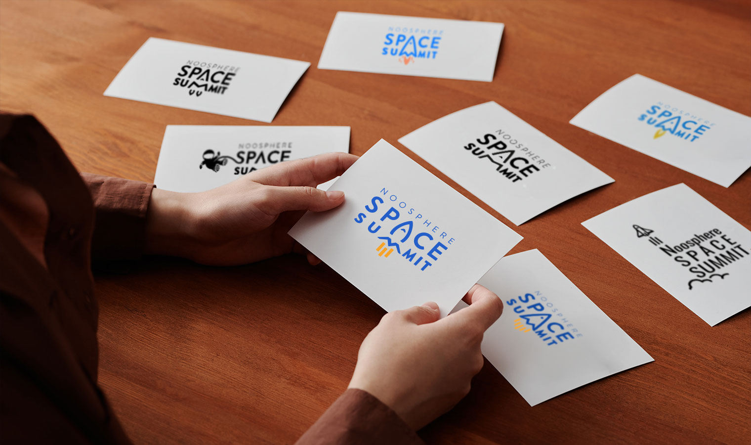
Font Engineering. Creating a Symbolic Logo.
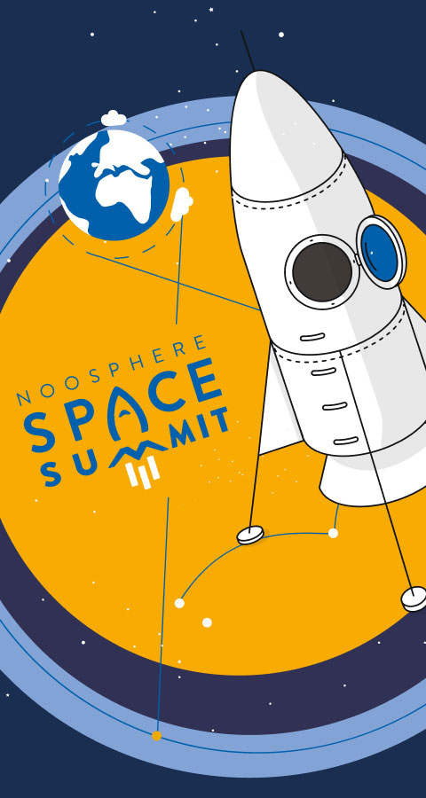
The task during logo creation was to combine textual elements with an illustrative component. The rocket as a symbol of the first Moon landing was realized based on the letters A and M and harmoniously fit into the logo’s typography.
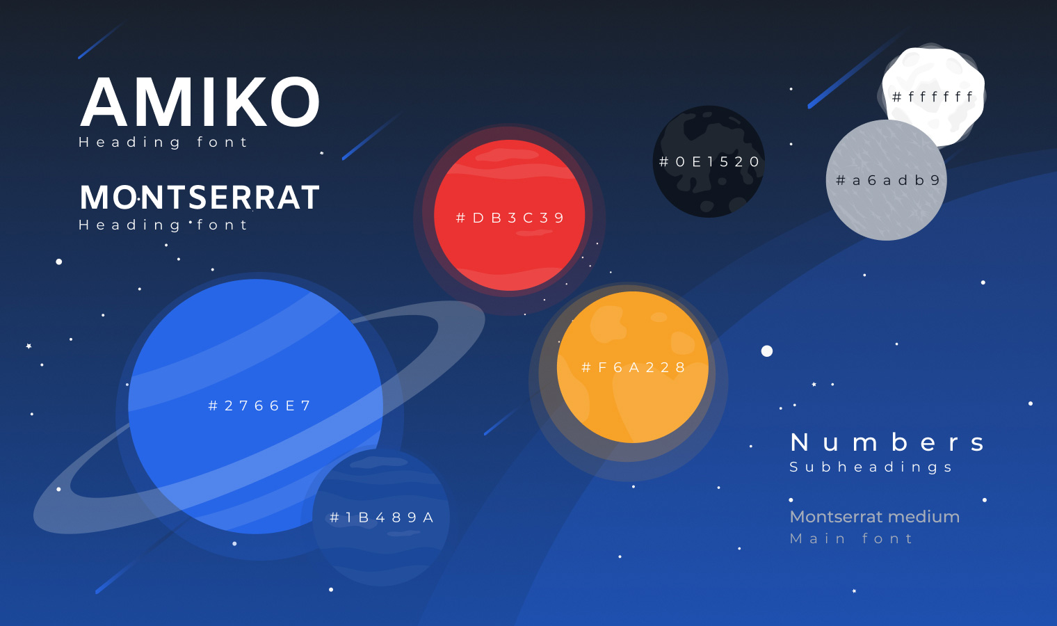
Space Palette: Triadic Harmony in Design
We took the deep dark blue color of space and yellow, which is closely associated with Ukraine’s identity as the summit’s location, as a base. To create additional contrasting visual accents in the palette, we added white and several other colors that are equidistant on Itten’s circle and form an equilateral triangle.
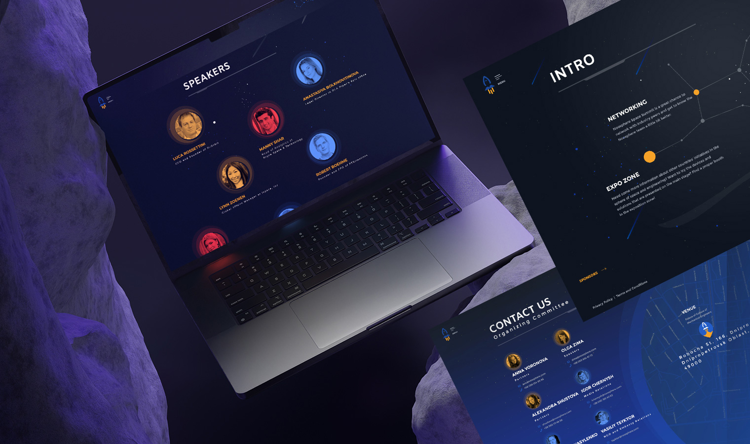
Conciseness and Convenience in Web Design
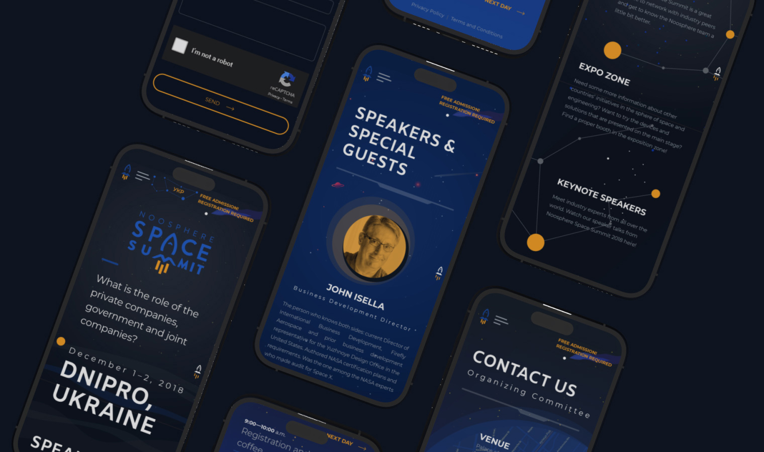
The main requirement for the website was to be minimalist and concise, emphasizing the event’s business mood. We implemented information about the venue, program, speakers, and registration on separate pages for easier perception and faster loading. The design was adapted for mobile devices, leaning towards simplification. HTML5, CSS3, JS, jQuery, and SVG animation technologies were used in coding.
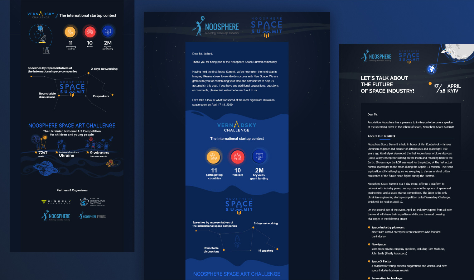
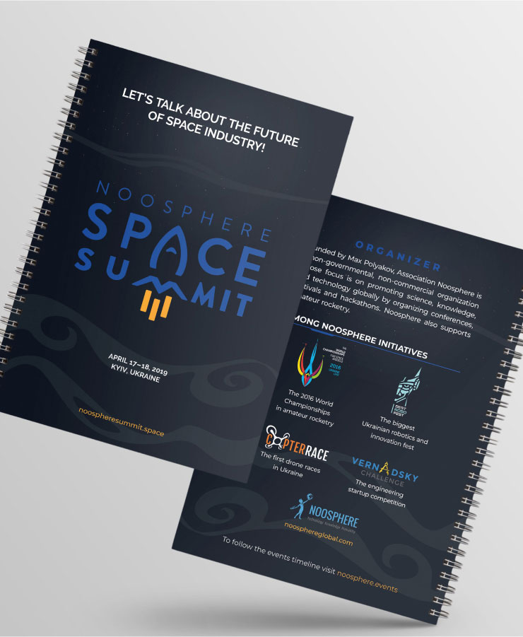
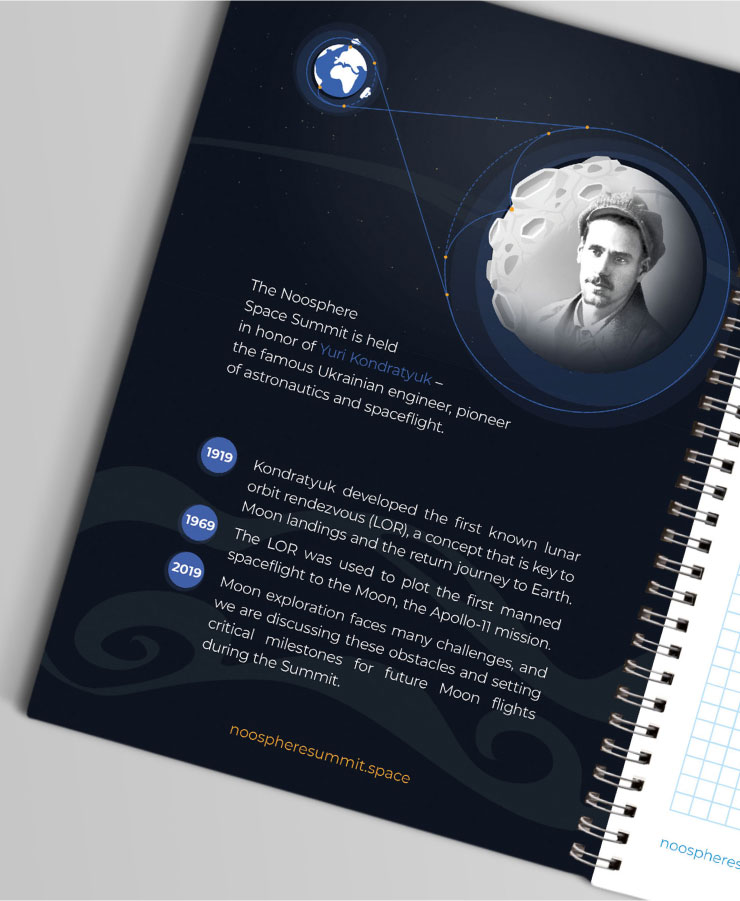
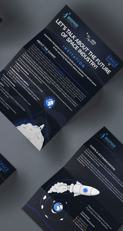
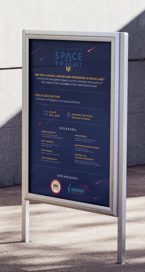
Unity in Print Diversity
Any large conference requires a large amount of high-quality, diverse printed materials in a very short time. So Crevio created invitations, business cards, flyers, brochures, posters, certificates, badges, banners, and citylights in a unified visual style. We managed to clearly place a large amount of information without overloading the composition.
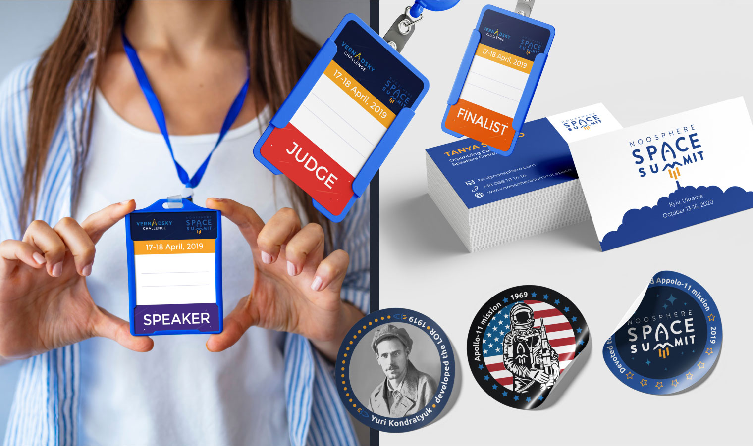

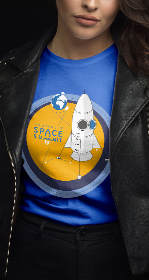
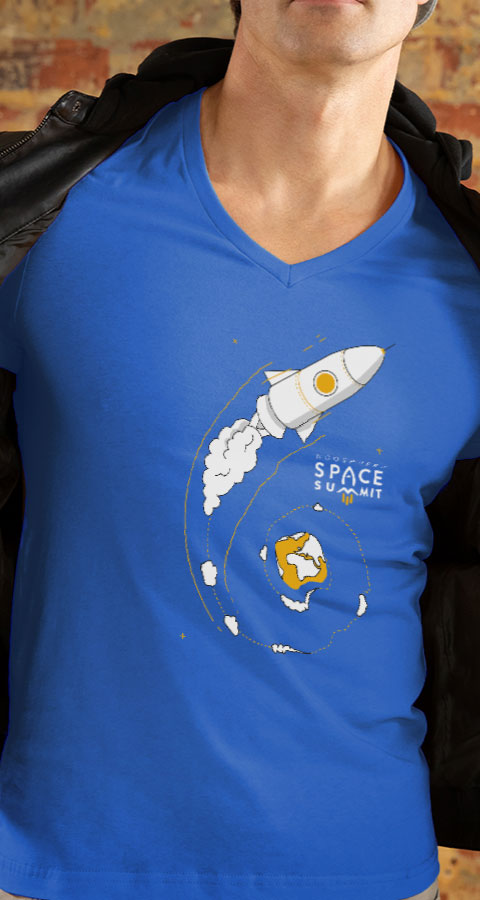
Merchandise for Increased Recognition
Creating merchandise is always an interesting creative task. To help conference visitors easily find organizers, the latter were dressed in branded T-shirts, which we designed. These T-shirts were also used as gifts for active participants. We also prepared branded notebooks, stickers, pens, notepads, and badges for the event.
Large Screen of Information Possibilities
We also created several backdrops for the large information screen at the conference, located on the stage. These were static and animated backdrops with graphic elements. We also created stylized elements for formatting speaker slides, partner advertisements, schedules, and other information. They enhanced the overall atmosphere of the presentations, making the stories even more interesting and informative.
Result
We created:
- 10+ Website pages
- 15+ Print material designs
- 5+ Emails
- 5+ Presentations
- 50+ Banners
- 10+ Screen backdrops
- 5+ Merchandise designs
- 5+ Videos
The project team included:
- Art Director
- 6 Designers
- 3 HTML Coders
- 3 Managers